You don’t need every data point to do PCA. I promise, it can work just as well even if you don’t interpolate first.
When you write a PhD dissertation, you end up spending a lot of time thinking about one very specific and esoteric topic. Every day. For years. Sometimes, you have to talk to someone outside of your research group, and when they ask what your dissertation is on, you confidently respond with the name of the problem you study, only to be met with a confused look and a misplaced sense of shock that they have no idea what you are talking about.
I get this cognitive dissonance everytime I tell someone my dissertation was on “matrix completion” and whenever someone mentions wanting to use PCA but having to deal with missing data points first. “You can do PCA without all the data”, I would exclaim, “it works better without interpolating!” Of course, the follow-up question to this point was always “how?”, and I had no good answer. Telling someone who is trying to solve a real problem that a technique works on paper is usually of no help.
Enter this blog post and the python package I made, SpaLoR. Amongst other features, SpaLor can do PCA when you have missing data by using matrix completion. In this tutorial, we’re going to use the Wisconsin breast cancer diagnostics dataset, which is included as an example dataset in scikit-learn. It consists of 30 morphological features from 569 breast tumour biopsies, along with a label of “malignant” or “benign”.
We start by loading in the data and necessary packages.
import numpy as np
import seaborn as sns

from sklearn.preprocessing import StandardScaler
from sklearn.decomposition import PCA
from sklearn.datasets import load_breast_cancer

breast_cancer = load_breast_cancer()
normalized_data = StandardScaler().fit_transform(breast_cancer.data)
There’s a reason this is a classic machine learning demonstration dataset: the features can predict the target variable using a linear model with incredibly high accuracy. When we do PCA and color the samples by diagnosis, we see an almost perfect seperation with just two principal components.
pca = PCA(n_components=2)
pca_data = pca.fit_transform(normalized_data)
ax=sns.scatterplot(x=pca_data[:,0], y=pca_data[:,1], hue=breast_cancer.target,s=10)
ax.set_xlabel("PC1")
ax.set_ylabel("PC2")
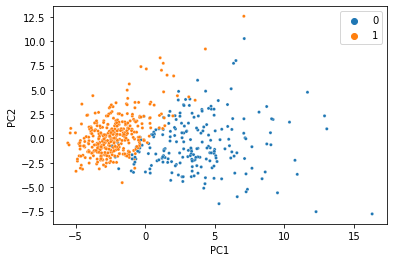
We were able to condense all 30 features into just two PCs, and the information we care about is still there. That’s less than 7% of the size of the original data, so it’s not too hard to believe that we don’t need 100% of the data to get a meaningful low-dimensional representation. Let’s simulate what would happen if 20% of the data was missing, and replaced with NaN.
missing_mask=np.random.rand(*normalized_data.shape)<0.2
missing_data=normalized_data.copy()
missing_data[missing_mask]=np.nan
missing_data[0:5, 0:5]
array([[ 1.09706398, -2.07333501,  1.26993369,  0.9843749 ,  1.56846633],
       [ 1.82982061, -0.35363241,  1.68595471,         nan,         nan],
       [ 1.57988811,  0.45618695,  1.56650313,  1.55888363,  0.94221044],
       [-0.76890929,  0.25373211,         nan, -0.76446379,         nan],
       [ 1.75029663, -1.15181643,  1.77657315,  1.82622928,         nan]])
If you tried giving sklearn’s PCA class this new matrix, you’d definitely get an error, so we’ll use the MC class in SpaLoR. We can use it the same way we used the PCA class:
mc = MC(n_components=2)
pca_missing_data=mc.fit_transform(missing_data)
ax=sns.scatterplot(x=pca_missing_data[:,0], y=pca_missing_data[:,1], hue=breast_cancer.target,s=10)
ax.set_xlabel("PC1")
ax.set_ylabel("PC2")
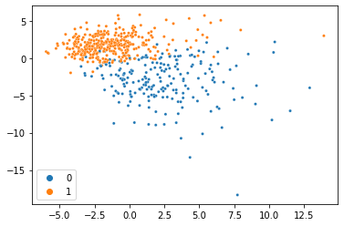
And voilà, we just did PCA with missing data and got almost the same thing! This dataset is so clean, we can actually do it with much less data too. Here’s the same thing with 80% of the data missing:
missing_mask = np.random.rand(*normalized_data.shape) <0.8
missing_data = normalized_data.copy()
missing_data[missing_mask] = np.nan
mc = MC(n_components=2)
pca_missing_data=mc.fit_transform(missing_data)
ax=sns.scatterplot(x=pca_missing_data[:,0], y=pca_missing_data[:,1], hue=breast_cancer.target,s=10)
ax.set_xlabel("PC1")
ax.set_ylabel("PC2")
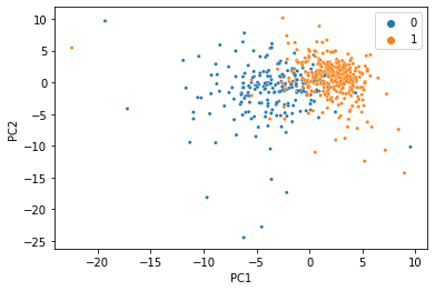
At this point, the seperation gets a little messier, but for just 20% of the data it’s not bad at all!